Freya Frozen Soups
Freya is a soup brand built on fresh, made-to-order delivery, but fresh soup has a short shelf life, which made retail a hard door to open. A frozen line solved that: same product philosophy, a shelf life that could actually survive a grocery aisle.

We were brought in to design the packaging for that first frozen SKU, working within an existing container so the label itself had to do all the work of standing out, building trust, and feeling like nothing else in the freezer aisle.
our process

what we kept in mind

perception of health brands
competitor landscape
brand gaps & opportunities
how to gain trust
reaching new demographics

The Research
We studied how better-for-you brands position their benefits, which shaped the front label directly: a vegetable grid pulled straight from that research, with value props tucked into the illustration instead of called out separately.

➱ Value points stated front and center  
➱ A solution for a variety of customers: people in recovery, new parents,
people on-the-go, health-concsious eaters
➱ Vegetable grid shows how clean the soup is
➱ Getting consumers attention by standing out from others on the same shelf

research included

competitor landscape
consumer perception
demographic needs
how to build trust
current brand analysis

The Design
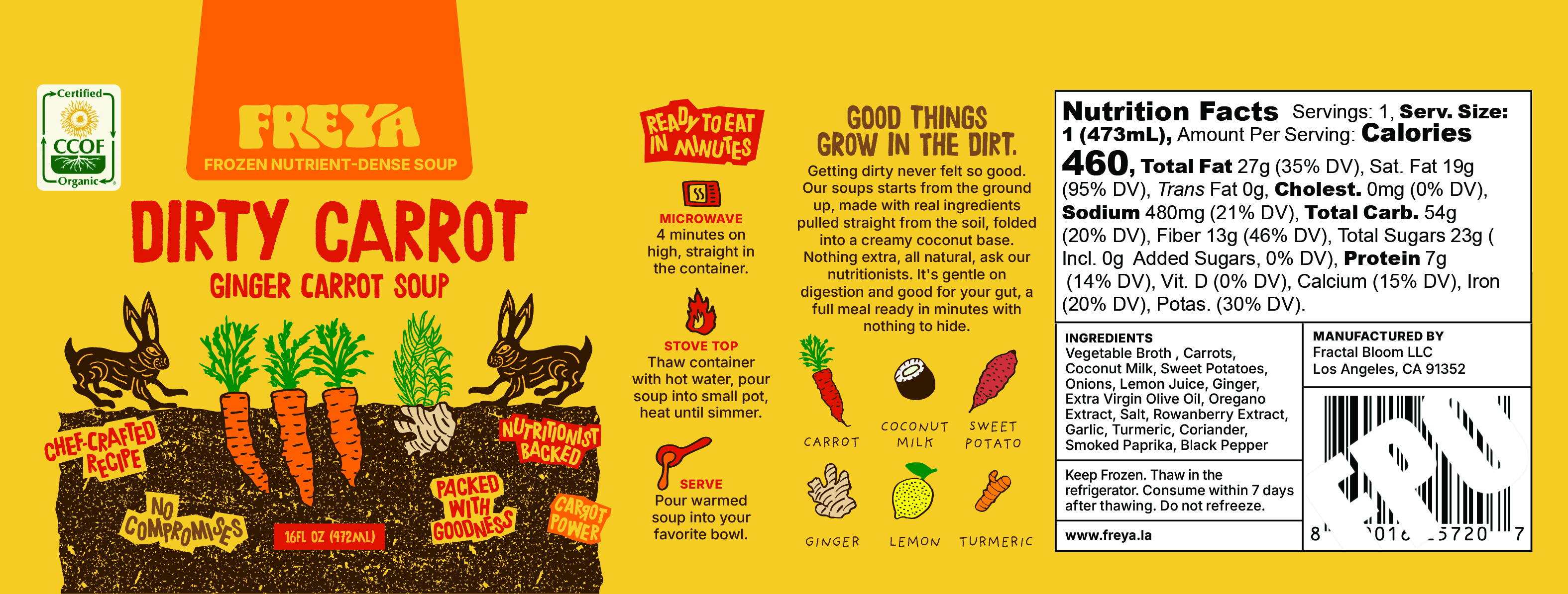
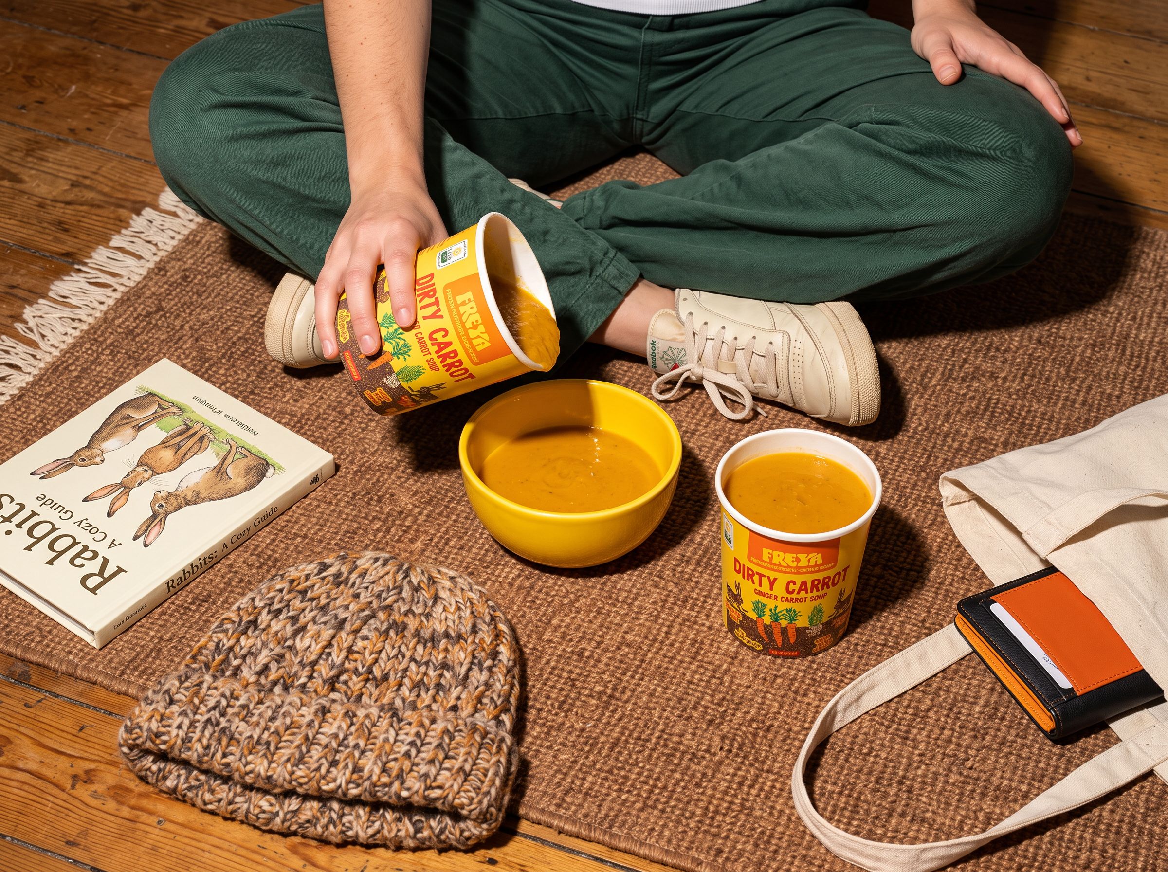
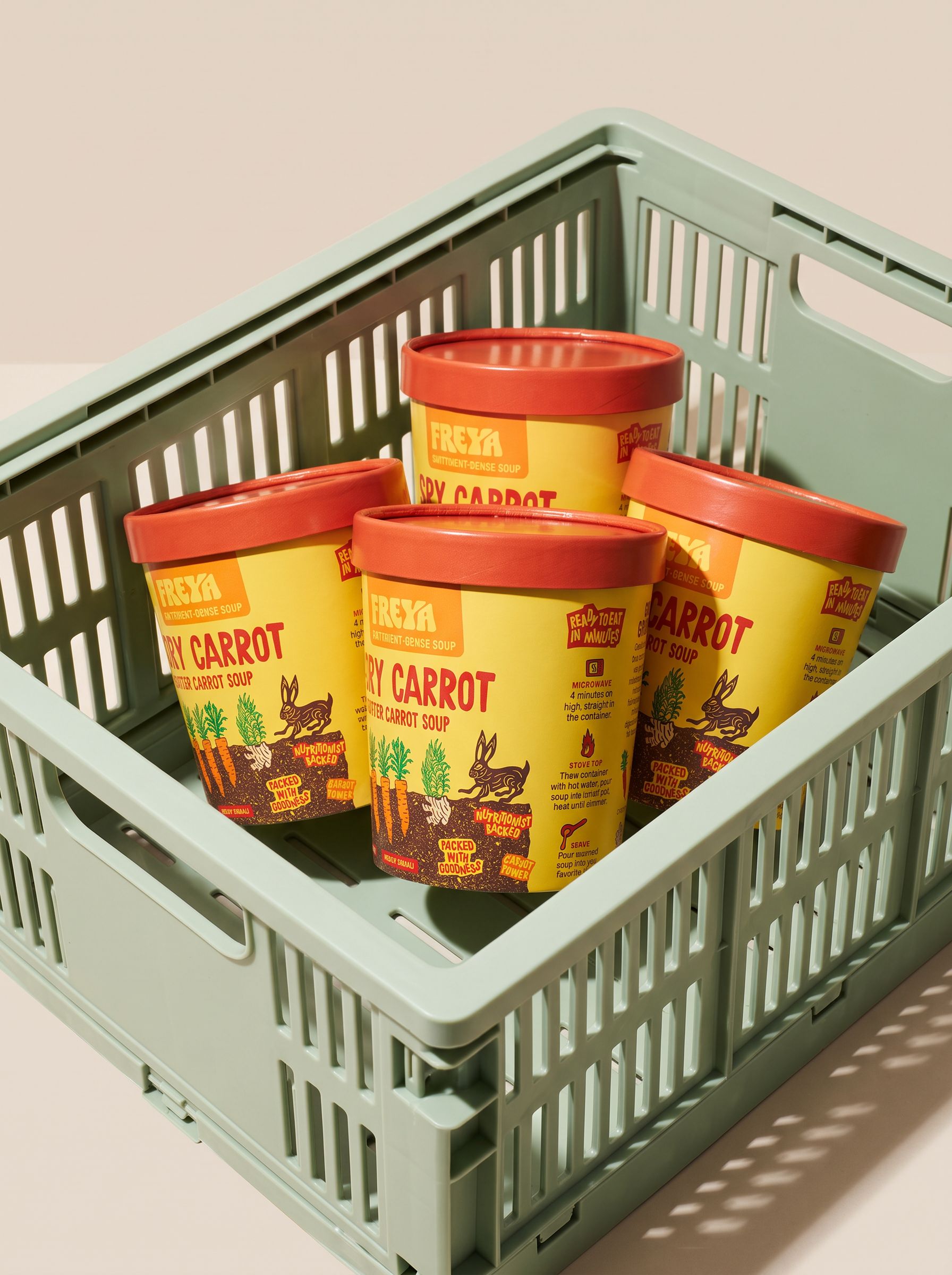
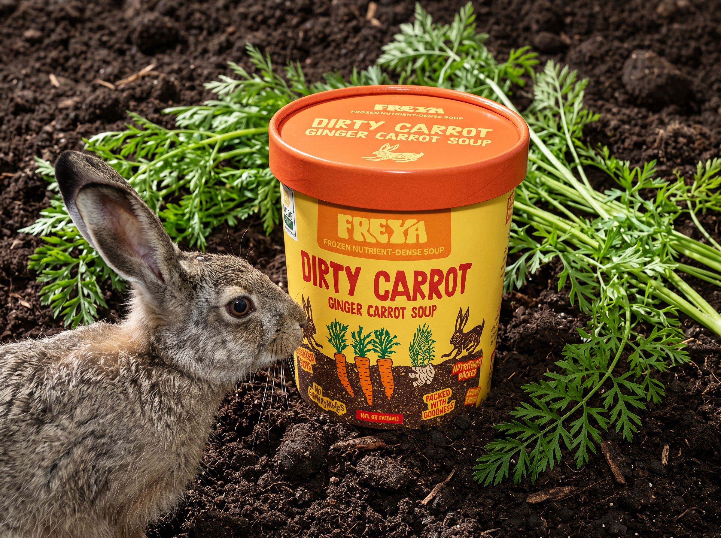
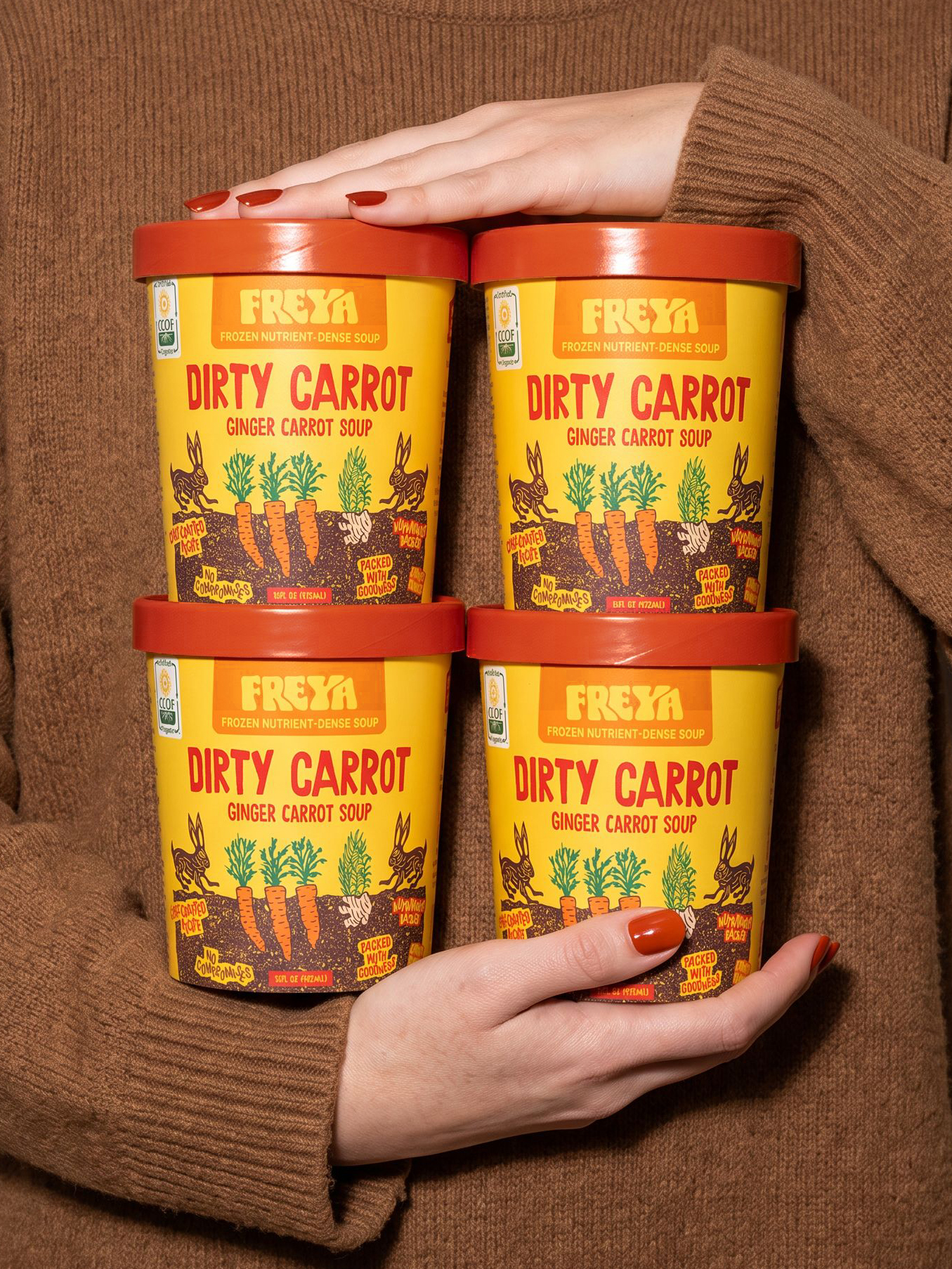
Every design decision traces back to Phase 1. The container itself was already a disruptor, most ready-to-eat frozen soups sit in white, boxy packaging, so the shape gave us a head start on standing out before a single mark was made.The soup came to us as Freya Nourish.

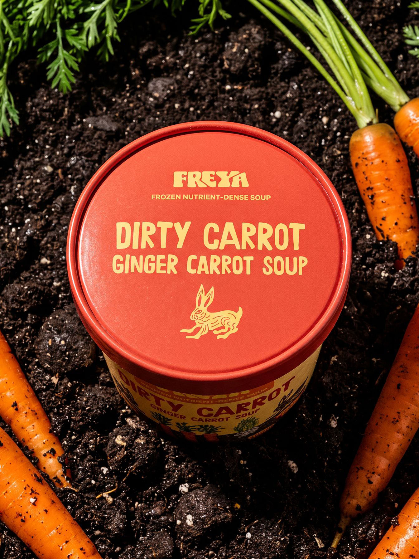
A naming exploration got us to Dirty Carrot, a name with enough personality to carry the whole voice of the pack. From there, the hand-drawn illustration, a hare (cool, not cute) alongside the carrot and vegetables, became the way to hold two things at once: an organic, handmade feel true to the brand, and bold, saturated color that pushes past Freya's current audience of older women toward a younger, broader consumer.

➱ Container shape already disrupts the category's white, boxy norm
➱ Landed on Dirty Carrot over Freya Nourish
➱ Hand-drawn art balances organic feel with bold, modern color
➱ Built to reach beyond the current demographic, and to scale across future flavors
naming direction
brand tone
concept development
scalability

explorations

SMOTHERED COOKIES ➩